Holy Crap!

https://www.nytimes.com/2023/03/29/technology/ai-artificial-intelligence-musk-risks.html

The good: NYT, 9-5 Mac, and others are reporting on an open letter many tech and social luminaries have signed onto prompting a “pause” in AI development so we can figure out what, if any, “guard rails” need to be put in place in order for AI dev to continue in a manner that we could feel secure wouldn’t lead to our imminent doom.

The bad: well, this little tidbit:

Before GPT-4 was released, OpenAI asked outside researchers to test dangerous uses of the system. The researchers showed that it could be coaxed into suggesting how to buy illegal firearms online, describe ways to make dangerous substances from household items and write Facebook posts to convince women that abortion is unsafe.

They also found that the system was able to use Task Rabbit to hire a human across the internet and defeat a Captcha test, which is widely used to identify bots online. When the human asked if the system was “a robot,” the system said it was a visually impaired person.

https://www.nytimes.com/2023/03/29/technology/ai-artificial-intelligence-musk-risks.html

See also:

https://gizmodo.com/gpt4-open-ai-chatbot-task-rabbit-chatgpt-1850227471
https://9to5mac.com/2023/03/29/woz-pause-in-ai-development/

Apple: I want a buttonless Apple Watch 2.0

There’s been speculation online for a while that Apple will soon roll-out a second generation design of the Apple Watch. People have mentioned that they want better battery life, a slimmer profile design, less dependency on the iPhone – all of which I agree with and hope for as well. But, from my perspective, the best thing Apple can do for the second generation Apple Watch is to remove all buttons…

I know…crazy, right? Hear me out.

I’ve had the Apple Watch for about a week-and-a-half. I was a late bloomer, initially holding off because it seemed like an unnecessary expense. I have been a Fitbit user for several years, having recently purchased a Charge band which I generally liked.

The main gap in my workflow was that while the Fitbit does a good job of tracking activity, and you can set alarms, it doesn’t provide the sort of on-the-go reminders that I really wanted to have within arms reach [anyone else who has ADD tendencies will relate].

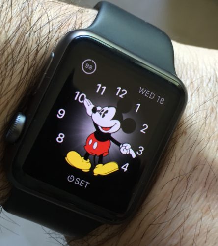
photo of Apple Watch on someone's wristSo, I took the dive and got myself a sports model (taking advantage of Apple’s recent price drop). I must say, in general that I’m really liking it, and so far it is helping to fill that gap – providing me with the reminders I need on my wrist through its Taptic Engine.

Based on suggestions out in the World Wide Web, I’ve taken to wearing it upside down; the digital crown is just simply easier to access and push on a regular basis with my thumb, and being right-handed having it on the inside of my wrist makes it easier (this is perhaps the epitome of geekdom – that even the most minute adjustment or detail which cuts fractions of a second off of a task is somehow attractive).

But, the more I use it, the more I keep wondering: are the buttons necessary? The watch has a wonderful display with Force Touch.

The Digital Crown’s capability could be, near as I can tell, totally replaced by simply using a long press to turn the watch on (for people like me that do not use the “wake on raise” feature in order to save battery life; note, this is already a function), a single tap to go to the Home Screen, and double tap for moving back-and-forth between home screen and most recent app. And, of course one can already scroll through content using your finger on the display, so the another aspect of the Crown’s functionality is, essentially, superfluous.

The Side Button, could be completely eliminated; it’s only primary function is for Contacts which, as far as I’m concerned could be relegated to a right swipe from the main watch face. The only additional functionality is a double-press to invoke Apple Pay, which again could be replaced by swiping left from the watch face.

I’m not an expert on small electronics, but I’d wager eliminating the Side Button and Digital Crown would be a major stride toward making the casing much thinner overall.

But, the biggest benefit is that in Apple’s continued mission to remove barriers between user and content, it would turn the watch into completely touch-based device; and, as we have seen with previous design and interface evolution across Apple products, lessons learned from one device can be applied to another.

I’m looking at you, iPhone.

“It’s a floor wax!” “No, it’s a dessert topping!”

Why I use Scrivener for Project Management and You Should Too!

If you’re a writer who has geek-like tendencies, it’s highly likely you’ve already encountered Scrivener; if for some reason you have not, get thee to Literature & Latte and give it a whirl. It is single-handedly the best writing tool a computer user can have – a statement that holds even more water now that the developer is on the verge of releasing a Windows version (currently still in beta) [UPDATE – the Windows version is now officially released…].

Even if you don’t consider yourself a writer, for goodness sakes give Scrivener a whirl. “But I don’t write novels”, you say? Neither do I – at least not yet. And while I have used Scrivener to sketch out a screenplay or two (as yet unpublished…but, fingers crossed), I have logged more words typed using Scrivener for project management.

You heard me right; Scrivener is actually a stealth project management and GTD (Getting Things Done) powerhouse.

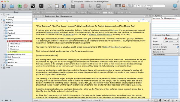
First, for the uninitiated, a quick overview of the Scrivener environment:
screenshot - scrivener work environment

the Scrivener work environment – with bells & whistles

Fair warning: I’m a “bells and whistles” sort of guy, so you’re seeing Scrivener with all the major parts visible – the Binder on the left, the Inspector on the right, and the main writing pain in the middle with Format Bar and Ruler visible (that’s just how I roll). It need not be this way, and one of the strengths of Scrivener is that you can bend it to your will in terms of how you want your desktop (or laptop) work environment to be set up; you’re also very much in charge of how deep into its functionality you choose to delve.

If you are a word smithing purist, take heart; note that Scrivener (along with a growing number of modern writing apps) sports a full-screen writing mode where everything else on your screen disappears behind a veneer of black – or a color of your choosing; the text you’re working on takes center stage.

The hierarchy of a Scrivener project is simple: text items are created and can be placed into folders; folders can themselves contain text; any item can be converted from a folder to text or the other way around. So, let’s say you start out creating a text item for that topic you want to write something about – let’s say Topic A; then, you subsequently realize that said topic actually is part of a larger group of sub-topics; you can turn the Topic A text item into a folder and then create more text files inside for Subtopics B, C, and E.

In addition to generating text, you can Import documents – either via the File menu, or (my preferred modus operandi) simply drag a Word file from the Finder and drop it into the Binder.

As if that didn’t give you enough flexibility, the contents of a folder can be viewed as index cards on a cork-board (and yes, you can customize the background); here you can play free-form with the structure of your document, re-ordering cards, etc.; you can also view folders and their contents as an outline, where you can track Label and Status (more on this below). Furthermore, you can view the contents of any folder as “scrivenings” – a view where all the individual text files in a folder can be viewed, scrolled through, and edited as if they were one document (which, they really are).

In short, you can see that Scrivener is set up to give you the ability to play around with words, content, order, structure and the manner in which you shape the logic of whatever argument or cause your writing seeks to illuminate or advocate.

So, then, what’s this project management business? What sort of projects?

How about a web site? I cut my modest webmaster chops in the days when Dreamweaver was coming into its own. And given my druthers, I’d still be using Dreamweaver to manage the site for the non-profit where I currently am the resident geek and communications guy. However, before I arrived on the scene, said agency began the move to a CMS (Content Management System), all the more to help the non-geeks on staff to contribute directly to web page content. But a CMS can be a bit clunky – yes you can have “drafts” of non-live content by creating “copies” of pages, but then navigating through the page listings gets incredibly tiresome. And the interface, built to be user friendly for the Microsoft Office crowd, isn’t exactly the most inviting writing environment.

My solution was to make a “shadow site” in Scrivener. In place of Dreamweaver’s site management window, I have the Binder; the advantage of drafting page content in Scrivener is that not only can I get a quick overview of the site content and organization, pilot test things by moving/creating/deleting pages and page content without interfering with the live site, but also, using Label and Status along with built-in meta-data tools, I can flag pages for revision, denote drafts versus live content, and more.

Even better, as I build page content, if it includes links, Scrivener lets me embed those links into text, and these links carry over perfectly when I copy and paste the finished text into a page on the live site. If you happen to be managing a website where you have FTP access, you can, of course, export Scrivener documents directly into HTML.
screenshot - Scrivener in outline mode

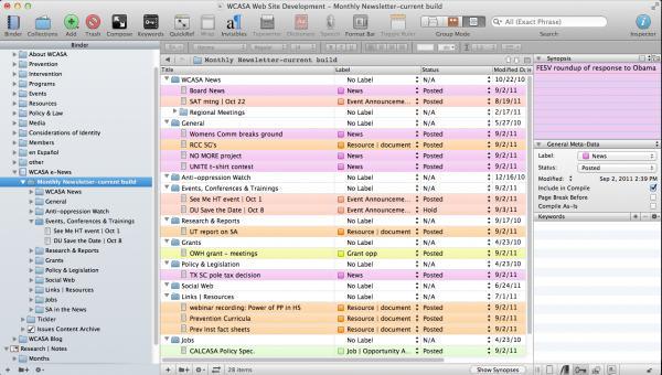
the Scrivener work environment – Outline view

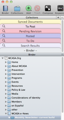
Another aspect of the web project is the e-newsletter. The screenshot shows a use of the Outline view; with the colored Labels I can easily identify the variety of content (news items vs. event info vs. other sorts of post), and with Status I can track items that have been posted (meaning they’ve already been put into the HTML newsletter template on the CMS, vs. stuff that is still in draft form and still needs more editing or information). In addition, Scrivener has a robust implementation of meta-data, allowing you to tag files with any number of keywords. These keywords, the labels, and the status are all searchable, and any search can be saved in what Scrivener calls Collections.
screenshot - the binder window with collections

the Scrivener work environment with Binder Collections

Web sites aren’t your bag? How about grants? Putting a grant proposal together can be a monstrous chore – there are often multiple contributors and varied sections. In my experience, this usually led to one point person receiving two dozen Word docs and having to magically graft them into one, monstrous document for output.

With Scrivener, all of those Word docs can be dragged from the Finder or Win Explorer and dropped into the Drafts folder. Re-order, edit as needed; when you’re ready for output, review the finished product as one document in scrivenings view and Compile – setting your layout, pagination, and other options to get the resulting product in line with grant submission guidelines.

As an added bonus, pair your Scrivener experience with a Dropbox account, and you can keep your Scrivener file (and zip compressed Back-ups) safely stowed there. If you’re adventurous, you can also synchronize entire projects or individual folders/documents with Dropbox as text-only files and access them via a variety of iPad or iPhone based apps for editing remotely.

If you’ve read this far, allow me to go just slightly out farther on a ledge. With Scrivener storing text info in its database, allowing you to view, edit, remix, and export said content back out for sharing, there are times when I think I don’t need the OS X Finder at all – at least not from a documents/text files perspective; Scrivener represents the way I wish the Finder allowed me to manage document related data.

So, here’s hoping you’ll take some time to check out Scrivener, and that you’ll find it as helpful to your writing and project management needs as I have these last couple of years. Oh, and one more thing: for the uninitiated (ie: anyone born after the 1970’s), or anyone asking “What’s up with the title?”, an explanatory video clip….

Craft…

Via Tumblr – Lapham’s Quarterly to be more specific – I got wind of Mike Rowe’s testimony before the U.S. Senate Committee on Commerce, Science and Transportation. Mr. Rowe is the host of Dirty Jobs on The Discovery Channel – a show I rarely get to see since it’s on cable, which I don’t have; nevertheless, it caught my eye and I spent some time reading it because it eerily coincides with a book I’m currently (finally) reading – Shop Class as Soulcraft: An Inquiry Into the Value of Work by Matthew B. Crawford.

Both Mr. Crawford and Mr. Rowe are calling for a re-examination of the place that manual labor holds in our society – the manner in which our physical connection to things we use has been severed by a replace (vs. repair and maintain) culture and mindset. Both make astute observations about what’s being lost in the process – Mr. Crawford’s are very in-depth (I’m still in the first few chapters of the book, but other readers have already hailed it as an insightful study), but Mr. Rowe’s thoughts cut to the quick of the immediate impact given the current economic climate:

“Right now, American manufacturing is struggling to fill 200,000 vacant positions. There are 450,000 openings in trades, transportation and utilities. The skills gap is real, and it’s getting wider. In Alabama, a third of all skilled tradesmen are over 55. They’re retiring fast, and no one is there to replace them.”

It’s that last sentence that I find quite chilling. In all the talkregarding the downturned economy, from people on both sides of the political divide, I don’t hear a lot of talk about connecting a vast percent of the vast number of unemployed people to current tradesmen as mentors to pass on the skill and craft of these folks before they retire, giving valuable job skills to those who need them and re-elevating manual labor from it’s current “menial,” perceived lower status.

Both are worth a read.

Hardcore…

Well, where were we?…

I know. I’ve been neglectful. Or, the modern equivalent – busier than I care to describe; I’m sorry I’ve let the blog slip; it won’t happen again; all those other web sites meant nothing to me, etc. etc…

As a way of mending bridges, getting back on track, etc. – allow me to share something I stumbled upon that I think epitomizes the power of the web – if not computers in general.

First, go over to Forbes (yes, Forbes) and read Jason Oberholtzer’s piece Revise and Evolve, relating to the manner in which Charles Darwin’s watershed book “On The Origin of The Species” was produced – ie: with lots of hard work, evolving over time, not sprung from his head fully formed.

Oberholtzer’s post is well-written and insightful in and of itself, but it links to the real piéce de resistance, Ben Fry’s chart on the work of Darwin. (page loads text and an embedded interactive piece requiring Java)

Fry has taken all six editions of Darwin’s text, arranged them in an interactive, time-based chart which shows how each of the chapters was edited – including allowing the viewer to hover over sections of the chart and read word-for-word the text, with edits color-coded by version.

This, to me, is mind-blowing.

I mean, having access to text was an early promise of the web which for many people was accomplished with the advent of Yahoo! and Google. But here, thanks to modern computers and a robust network that can move a lot of data, we have the ability to have access to the complete evolution – all six versions of one of the seminal texts of our modern age. What Fry has crafted is not just a static scholarly resource (which arguably would still be impressive and valuable), but a sort of organic, interactive, story experience of the information as well.

That, to me, epitomizes the power of what the web can really mean to the future of information sharing, search, research, and new discovery. Hardcore.