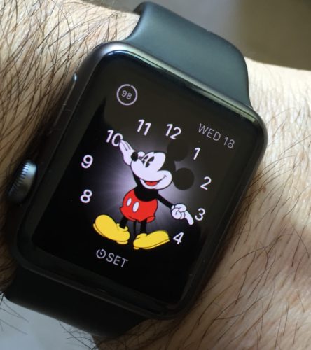
There’s been speculation online for a while that Apple will soon roll-out a second generation design of the Apple Watch. People have mentioned that they want better battery life, a slimmer profile design, less dependency on the iPhone – all of which I agree with and hope for as well. But, from my perspective, the best thing Apple can do for the second generation Apple Watch is to remove all buttons…
I know…crazy, right? Hear me out.
I’ve had the Apple Watch for about a week-and-a-half. I was a late bloomer, initially holding off because it seemed like an unnecessary expense. I have been a Fitbit user for several years, having recently purchased a Charge band which I generally liked.
The main gap in my workflow was that while the Fitbit does a good job of tracking activity, and you can set alarms, it doesn’t provide the sort of on-the-go reminders that I really wanted to have within arms reach [anyone else who has ADD tendencies will relate].
 So, I took the dive and got myself a sports model (taking advantage of Apple’s recent price drop). I must say, in general that I’m really liking it, and so far it is helping to fill that gap – providing me with the reminders I need on my wrist through its Taptic Engine.
Based on suggestions out in the World Wide Web, I’ve taken to wearing it upside down; the digital crown is just simply easier to access and push on a regular basis with my thumb, and being right-handed having it on the inside of my wrist makes it easier (this is perhaps the epitome of geekdom – that even the most minute adjustment or detail which cuts fractions of a second off of a task is somehow attractive).
But, the more I use it, the more I keep wondering: are the buttons necessary? The watch has a wonderful display with Force Touch.
The Digital Crown’s capability could be, near as I can tell, totally replaced by simply using a long press to turn the watch on (for people like me that do not use the “wake on raise†feature in order to save battery life; note, this is already a function), a single tap to go to the Home Screen, and double tap for moving back-and-forth between home screen and most recent app. And, of course one can already scroll through content using your finger on the display, so the another aspect of the Crown’s functionality is, essentially, superfluous.
The Side Button, could be completely eliminated; it’s only primary function is for Contacts which, as far as I’m concerned could be relegated to a right swipe from the main watch face. The only additional functionality is a double-press to invoke Apple Pay, which again could be replaced by swiping left from the watch face.
I’m not an expert on small electronics, but I’d wager eliminating the Side Button and Digital Crown would be a major stride toward making the casing much thinner overall.
But, the biggest benefit is that in Apple’s continued mission to remove barriers between user and content, it would turn the watch into completely touch-based device; and, as we have seen with previous design and interface evolution across Apple products, lessons learned from one device can be applied to another.
I’m looking at you, iPhone.
